Since the theme of the completed deco is supposed to be a surprise, everything else, including a scan of my spread is under the fold.
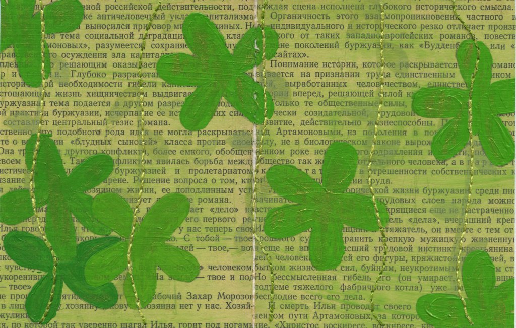
I decided to make a deco in the theme "your favourite colour." Each artist signs a spread using her favourite colour. Below is my spread in green (of course). It took me forever because I hit that unmarked fork in the road where the design either goes to heck and then the garbage can or heads towards the bright and shining future complete with singing peasants.
I hadn't planned well or tested my materials so I had quite a bit at stake when it came time to figure out what I was actually doing. My first mistake was using premixed acrylic paint. I'm getting better at mixing colours but it was a pain in the arse to match the olivey green on the background. My green chalk stamp pad also didn't show up as well as I had hoped and I realized that I didn't have an green paper (no, really!) that matched the base colour either. (That's the one area where Japanese paper consistently fails me: green things.) So after stamping the vines (you can barely see them but they're there), I broke out the embroidery floss and did some stitching.
Imagine the piece below without the flowers. I was stuck. I had this segmented spread with a difficult-to-match base colour. And no idea what to do next, which is why it sat around for a week and half until I went back to a favourite motif of mine: the scattering cluster. At this point, however, I did have to mix the paint for the flowers. I started off with phtalo green and hansa yellow because I wasn't really thinking. Too bright but it did produce a beautiful emerald green that I've stored away in my notebook. Pthalo green and cadmium yellow light worked much better but it was still too bright so I added some gold paint, which simultaneously made it sparkly and dulled it. I love that. After painting on the flowers, the whole thing was still too flat so I dry brushed some gold paint onto the flowers.
I can live with this. And I'm so happy that I didn't have to chuck it.

No comments:
Post a Comment